Alisa Kurdya ™
Hello, I’m Alice! I’m a graphic designer with experience at a full-cycle advertising and production company. I develop branding and identity, design merchandise and print materials, create presentations, social media graphics, and website banners. I’m proficient in Adobe Creative Suite (Ps, Ai, Id), Figma, Tilda, and AI tools. I manage projects from idea to final layout or landing page — on brief, on time, and production-ready
Experience
In addition to professional skills, I can mention my high efficiency and responsible approach to business. I'm not afraid of difficult tasks — on the contrary, I'm interested in learning new things and quickly mastering what I've never encountered before. I love learning, learning from colleagues, and growing from project to project.

01
art school
02
secondary professional education
03
advertising and production company
04
commercial restoration

To see Nabludatel
4primetou™
View more
View more
View more
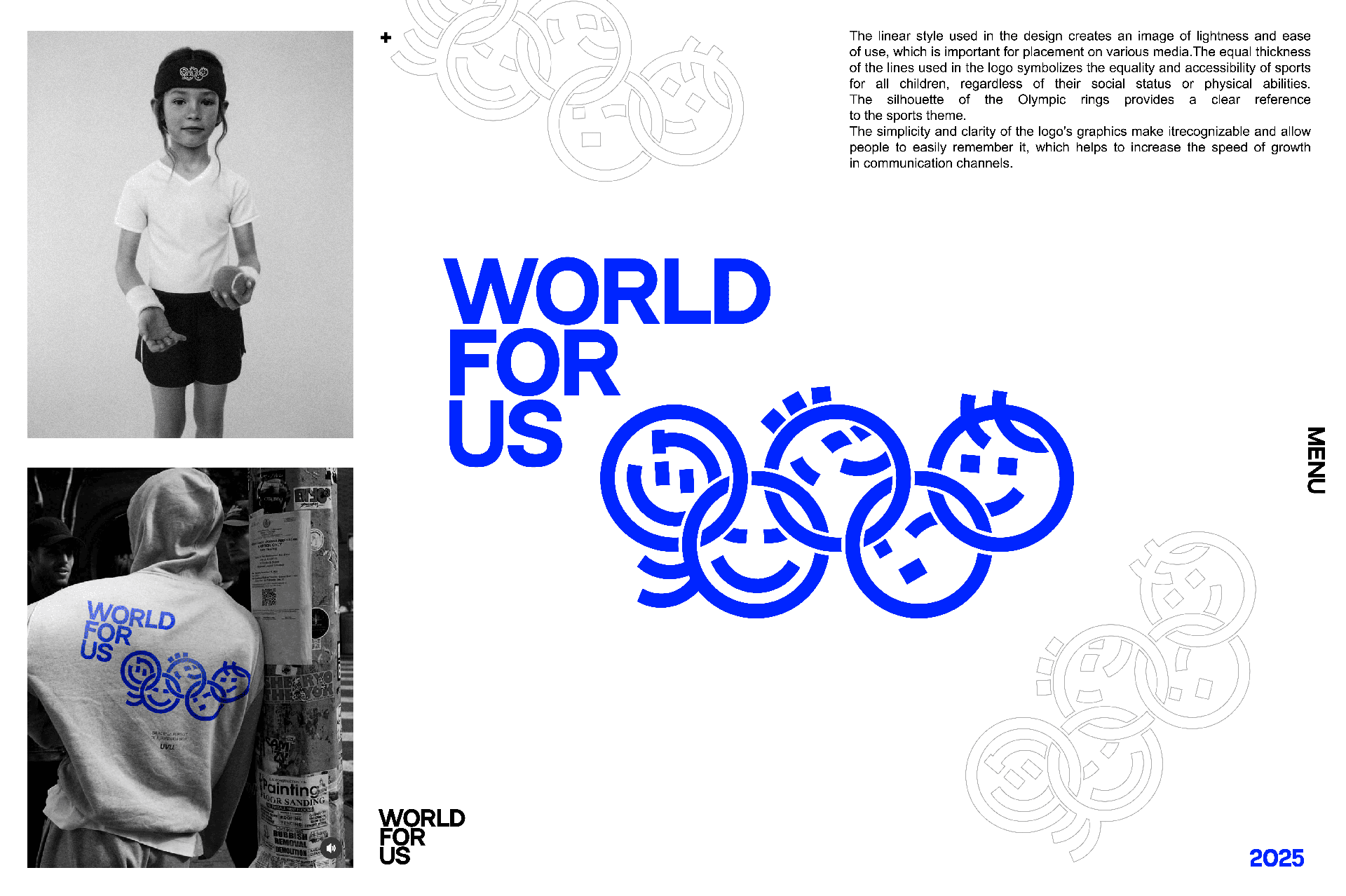
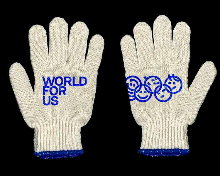
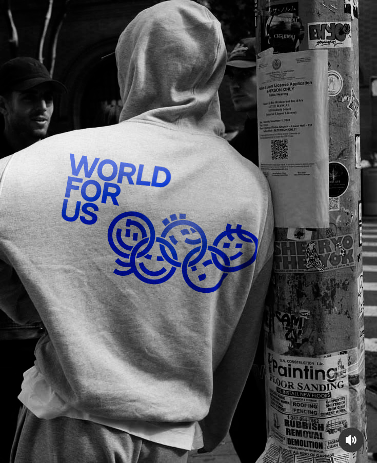
The linear style used in the design creates an image of lightness and ease of use, which is important for placement on various media. The equal thickness of the lines used in the logo symbolizes the equality and accessibility of sports for all children, regardless of their social status or physical abilities. The silhouette of the Olympic rings provides a clear reference to the sports theme. The simplicity and clarity of the logo’s graphics make it recognizable and allow people to easily remember it, which helps to increase the speed of growth in communication channels.
2025
click here
close ↵
client
WORLD FOR US
task
development of a logo and corporate identity media
When developing the logo, the priority was to find a balance between symbolism and functionality. Several concepts were tested on different media — from small badges to large banners — to ensure legibility at any scale. The choice of line thickness was not accidental: it was optimized for both digital screens and physical printing, including embroidery and engraving. The open, unclosed contours of the shapes were intentionally used to convey a sense of movement and accessibility. The final mark is minimal but rich in meaning — it works without extra decoration, leaving room for the brand’s own story.
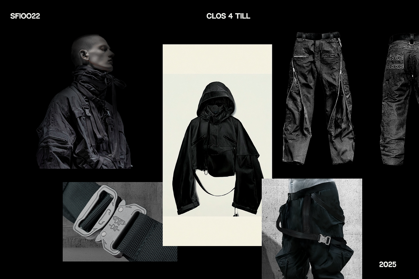
This project unexpectedly landed on me and turned out to be one of the most unique experiences in my practice. I developed a clothing concept for Till Lindemann (Rammstein) — specifically trousers and outerwear. Till had his own vision and specific requests. My task was not just to draw, but to deeply understand his personality, his stage presence, his physicality. The concept was built around the contrast of brutal strength and vulnerable intimacy — heavy textures combined with surgical precision of cuts, dark monochrome base with sudden accents. The silhouette references both industrial aesthetics (construction harnesses, oversized pockets, protective overlays) and almost ritualistic tailoring — as if the clothes are armor, but armor that reveals as much as it hides
2025
click here

close ↵
client
Till Lindemann (Rammstein)
task
clothing concept development
I worked closely with Till’s manager feedback, iterating until every detail felt right for him. The final package included technical sketches, material suggestions, and detailed mood boards explaining the design logic. After approval, we handed everything over to a professional garment constructor who translated my concept into actual production-ready patterns. This project taught me how to work with a strong artistic personality while keeping my own design voice intact — and that sometimes the most unexpected briefs become the most rewarding ones.
LOGOFOLIO
View more
View more
View more
View more
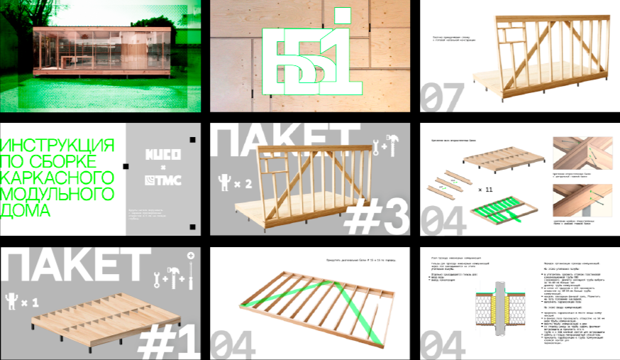
This project was a full-scale development of a comprehensive instruction manual for assembling a modular block system. Unlike typical technical documentation, my goal was to treat the guide as a visual object — functional, clear, but also aesthetically considered. From the very beginning, I focused not only on the technical accuracy of the instructions but also on how the user interacts with the visual language. The color palette was carefully chosen: bright green for key actions and attention points, white for clean negative space, and gray for secondary information and structural elements. This trio creates a clear hierarchy without overwhelming the reader. I incorporated subtle elements of constructivism — dynamic diagonals, geometric precision, and a sense of industrial rationality. The layout avoids chaos: each spread is structured yet feels slightly alive thanks to the sharp accents of green and the asymmetrical placement of certain graphic blocks.
2025
click here
close ↵

client
TMC TEAM
task
Modular Block Assembly Guide
The final instruction manual is more than just a set of steps. It’s a visual guide that respects the user’s time and attention. The bright green highlights make it impossible to miss critical actions, while the gray and white background keeps the reading experience calm and focused. The modular block itself becomes easier to understand — and even enjoyable to build — thanks to the clarity and personality of the design.
In addition to professional skills, I can mention my high efficiency and responsible approach to business. I'm not afraid of difficult tasks — on the contrary, I'm interested in learning new things and quickly mastering what I've never encountered before. I love learning, learning from colleagues, and growing from project to project.
Clothes
I’ve worked extensively with prints and merchandise across different types of products. Apparel design is something I genuinely enjoy — from concept to final print. Another key skill I’ve developed is efficiently finding and vetting contractors, which helps move projects from mockup to finished product without unnecessary delays.
Web
I create modern, responsive websites — from simple landing pages to larger multi-page platforms. My process focuses on smart structure, clean visuals, and smooth user interactions, so the end result is both practical and attractive. I pay attention to every detail, including typography and mobile performance, making sure your site looks polished and runs flawlessly on any screen.
Brand Identity
A strong logo is just the beginning. I design unique, versatile logos that reflect your brand and help you stand out. Then I build a complete visual identity around them — colours, typography, graphic elements — to create a consistent system that boosts recognition, shows professionalism, and connects emotionally with your audience.